Work with a custom notification template
If you need more flexibility than the BaseNotificationOptions interface provides, you can define custom templates.
A custom template lets you:
-
Specify alignment of buttons and the indicator
-
Specify color of the indicator
-
Change the layout (composition) and behavior of the body section, with template fragments
How it works
You define a custom template with the properties of the TemplateCustom object. You then pass the template to the templateOptions property of the NotificationOptions object, together with the properties of the templateData object that defines the data to include in the notification.
Buttons or indicator
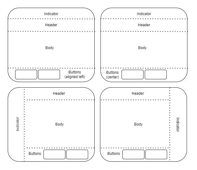
You can change the alignment of the buttons (left vs. right) and the position and color of the indicator area:

The buttons.align property can be set to "left", "center", or "right"; the default value is "right".
The indicator.align property can be set to "left", "center", or "right"; the default value is "center". For "left" and "right", the indicator text is rotated correspondingly.
The header color can be set both in a template and when creating a notification instance. The color defined on a notification instance overrides the template color.
Body section
A custom template can include the following template fragments in the body composition of the template. In Workspace v13 and later, some of these fragments are clickable. This lets you present additional information, for example, that your users might need before clicking a button with its call to action. See also Work with actionable fragments for an example. The the API reference for ActionableFragment documents the additional properties that are supported for actionable fragments.
-
Container: ContainerTemplateFragment This type has no visible parts. It serves to group other fragments. Can be clickable.
-
Text: TextTemplateFragment
-
List: ListTemplateFragment
-
Image: ImageTemplateFragment. Can be clickable.
-
Clickable text: ActionableTextTemplateFragment
The style property of a fragment takes values of React inline style properties, with the exception of position:fixed, which is not allowed.
How to do it
You specify the template type (template: custom) in the notification definition, but you can specify templateOptions either as a set of properties in the notification definition, or as a separate custom template object. The following example defines a separate custom template object.
- Define the custom template:
const exampleCustomTemplate: CustomTemplateOptions =
{
  // align the buttons to the left instead of the default right position
  buttons:
  {
    align: "left",
  },
  // align the indicator banner to the right instead of the default center position
  indicator:
  {
    "right",
  }
  // define the body with a text template fragment
  // note that this fragment type is not clickable, unlike actionableText
  body:
  {
    compositions:
    [{
      minTemplateAPIVersion: "1",
      layout:
      {
        type: CustomTemplateFragmentNames.text,
        // specify the key that"s defined in notification options
        dataKey: "message",
        // if the dataKey is missing from the notification definition,
        // the notification is still displayed without the fragment
        optional: true,
        // add react styles
        style:
        {
          width: "500px",
          padding: "5px",
        },
      },
    }],
    fallbackText: "Notification template out of date",
  },
};
- Define the notification and include the template object:
const exampleNotificationWithCustomTemplate: NotificationOptions =
{
  title: "Custom Template Notification",
  icon: "oflogo.png",
  toast: "sticky",

  // user interaction with button
  buttons: [
    {
      title: "CTA Button",
      iconUrl: "favicon.ico",
      onClick: { btn: "Button 1 clicked" },
      cta: true,
    },
  ],
  // explicitly specify the template type
  // not needed for markdown templates
  template: "custom",

  // include the custom template and define the properties declared there
  templateOptions: exampleCustomTemplate,
  templateData: {
    // the dataKey defined in the custom template
    message: "My Custom Notification Message",
  }
};
Manage API versions
In future versions of the Notification Center API, OpenFin may introduce new fragment types as we identify new customer needs. However, this raises the possibility that an application might use a template with a fragment type from a newer API version, but run in an OpenFin environment where an older API version is installed.
To handle such a situation, you can define multiple compositions for a template, with a minimum version specified for each one (composition.minTemplateAPIVersion as in the example in this article). A layout with a recent minimum version can use all available fragment types; a fallback layout that specifies an earlier minimum version enables users whose environments are not current to still experience the notification with a more limited layout.
You can define a fallbackText property for a template, with a message to display if the environment version does not support any layout that you have defined.
You can discover the API version of the template library with the VERSION constant, which is a version string in semver format.
Updated about 1 year ago
