Workspace themes with color-picking
Starting in Workspace 5.0, you can customize the colors of the user interface components used in Browser by defining a color theme. With Workspace 5.5, the use of themes includes Home and Storefront.
You can define and register a theme for a workspace platform. If you don't define a theme, you get a default palette.
Colors can be specified in the following ways:
- Hexadecimal, not case specific, 3 (#F0F) or 6 characters (#FF00FF)
- HSL/HSLA
- RGB/RBGA
- CSS color names — optional color properties only
The backgroundPrimary color property must be specified using a numeric format (that is, not a name); otherwise errors are thrown.
Starting in Workspace 10, your users can choose a light or dark color scheme, or the underlying OS color scheme. You can provide custom light and dark schemes as part of your custom theme, or you can define only a light scheme or a dark scheme to provide the same scheme to all your users.
You can also customize the location and UI string of the default Appearance menu. For details, see Customize light/dark scheme menu.
If a user's system contains multiple workspace platforms, each Workspace application (Browser, Home, and Storefront) retains the theme of the workspace platform it was opened with, until closed or changed. Therefore, the user's screen may show Workspace windows with different themes, depending on which workspace platform created each window.
Simple theming
The most straightforward way to define a theme is to define only the required properties:
brandPrimarybrandSecondarybackgroundPrimary
All other properties then either are generated based on these color values or use default colors.
The properties background1 to background6 are generated based on backgroundPrimary. Internally, the backgroundPrimarycolor is translated into HSL format, and then other shades are generated by varying the saturation and lightness values. The following diagram shows how shades are generated based on the color red, which has a hue value of 352.
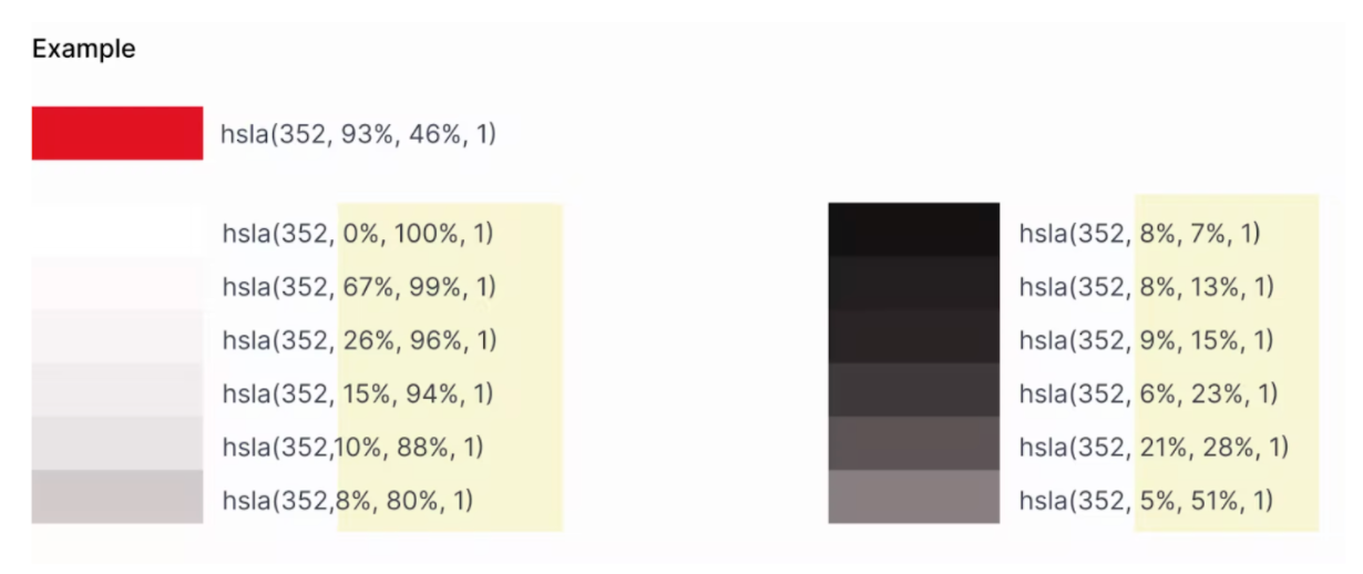
Diagram of light and dark auto-generated color values
The generated values are used to provide depth for visual components, such as for drop shadows. Workspace selects between light shades and dark shades, depending on the operating system's color mode.
Other colors are generated from brandPrimary and brandSecondary. These include colors for active, hover, focused, and text.
Code example
const wp = WorkspacePlatform.init({
…
  theme: [
    {
      label: 'MyTheme',
      palette: {
        brandPrimary: '#0661DC',  // Hexadecimal, 3 or 6 digits
        brandSecondary: rgb(170, 136, 166) , // RGB, optional: rgba()
        backgroundPrimary:  hsl(3, 23%, 17%)  // HSL, optional: hsla()
      }
    }
  ],
});
UI mappings of required properties
Here are examples of the color properties that are required to be defined in a theme. In the screen shots, the color property is set to vermillion (#D55E00).
brandPrimary
Example: dialog box default button background

A dialog box with the default button (Close Window) colored vermillion
-
brandSecondaryExample: dialog box other button background

A dialog box with a non-default button (Cancel) colored vermillion
-
backgroundPrimaryExample: Used to generate
background2, used in Browser page title bar background, focussed/selected view tab

The top of a window with the title bar and active view tab background colored vermillion
Advanced theming
If you prefer, you can specify additional color properties, rather than using generated or default colors. For optional properties, you can use CSS named colors instead of numeric definitions.
background2: 'rebeccapurple'
Here are examples of optional color properties. In the screen shots, the color property is set to vermillion (#D55E00). For a complete list of properties, refer to the Workspace Platform API reference.
inputBackground
Example: Save As dialog box user input background
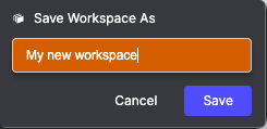
The Save Workspace As dialog box, with the background for the workspace name colored vermillion
-
background1Example: Browser view title bar background. Note that
background1is also used as the color of the static divider between Views in Pages.

The top of a window, with the inactive view tab and view tab area colored vermillion
-
background2Example: Browser page title bar background, focussed/selected view tab

The top of a window with the title bar and active view tab colored vermillion
-
background3Example: Store search bar background. Note that
background3is also used as the color of the divider between Views in Pages when the user is dragging a View to rearrange it.

The search bar in Store, with the background colored vermillion.
-
background4Examples:
- focussed toolbar button
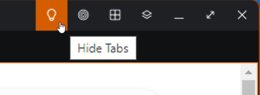
The OpenFin toolbar, showing the Hide Tabs icon selected and colored vermillion
- sub-toolbar background

The OpenFin toolbar, with the color linking sub-toolbar displayed and its background colored vermillion
- dialog background
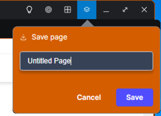
The Save page dialog box, with the background colored vermillion
-
background5Example: Back button in search
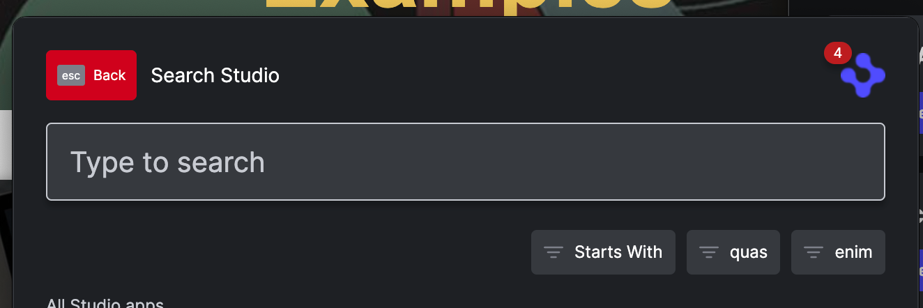
The Back button from Search colored TODO
-
background6Examples:
- Browser sub-toolbar outline
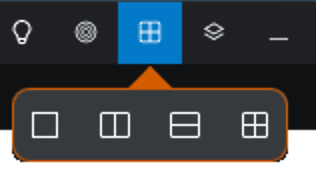
The OpenFin toolbar with the Change Layout sub-toolbar displayed, with the outline of the sub-toolbar colored vermillion
- dialog box outline

A dialog box with its outline colored vermillion
statusActive
Example: Selected page tab background

The top of a window, where the active page tab background is colored vermillion
inputColor
Example: input box text and caret color
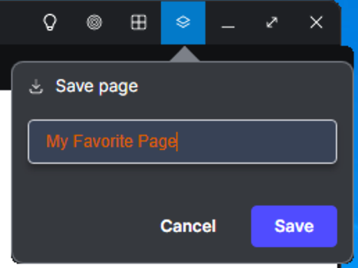
The Save page dialog box, with the entered text and caret colored vermillion
inputFocused
Example: Outline around selected text box
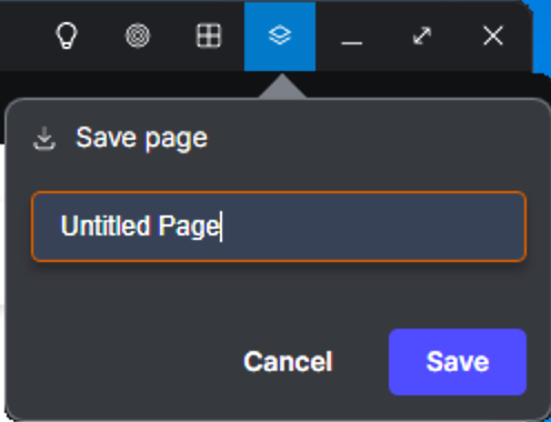
The Save page dialog box, with the focussed text field outlined in vermillion
textDefault
Examples:- Browser title bar icons & controls, selected view tab text

The top of a window, with the OpenFin toolbar and window control icons and the selected view tab label text colored vermillion
- Dialog box message text

A dialog box, with the message text colored vermillion
textHelp
Example: Browser unselected view tab text

The top of a window, with the unselected view tab label colored vermillion
Content backgrounds
Starting in Workspace 9.2, we've introduced a set of content background color properties to help you customize backgrounds not accounted for elsewhere. The only property currently implemented is contentBackground1, but four others, through contentBackground5, will be available as needed. contentBackground1 lets you customize the background color of the hero (or "header") in Store.
Example:

The main header (hero) element in Store, with the background colored vermillion.
Updated over 1 year ago
