Parts of windows in Browser
Windows in OpenFin Browser contain several components, some of which are not typical for web browsers you are probably familiar with. Other components you might expect are not included. This article describes each of the provided components. Refer to Customize Browser features for details on removing, changing, or adding items to Browser windows.
The following figure shows these components.
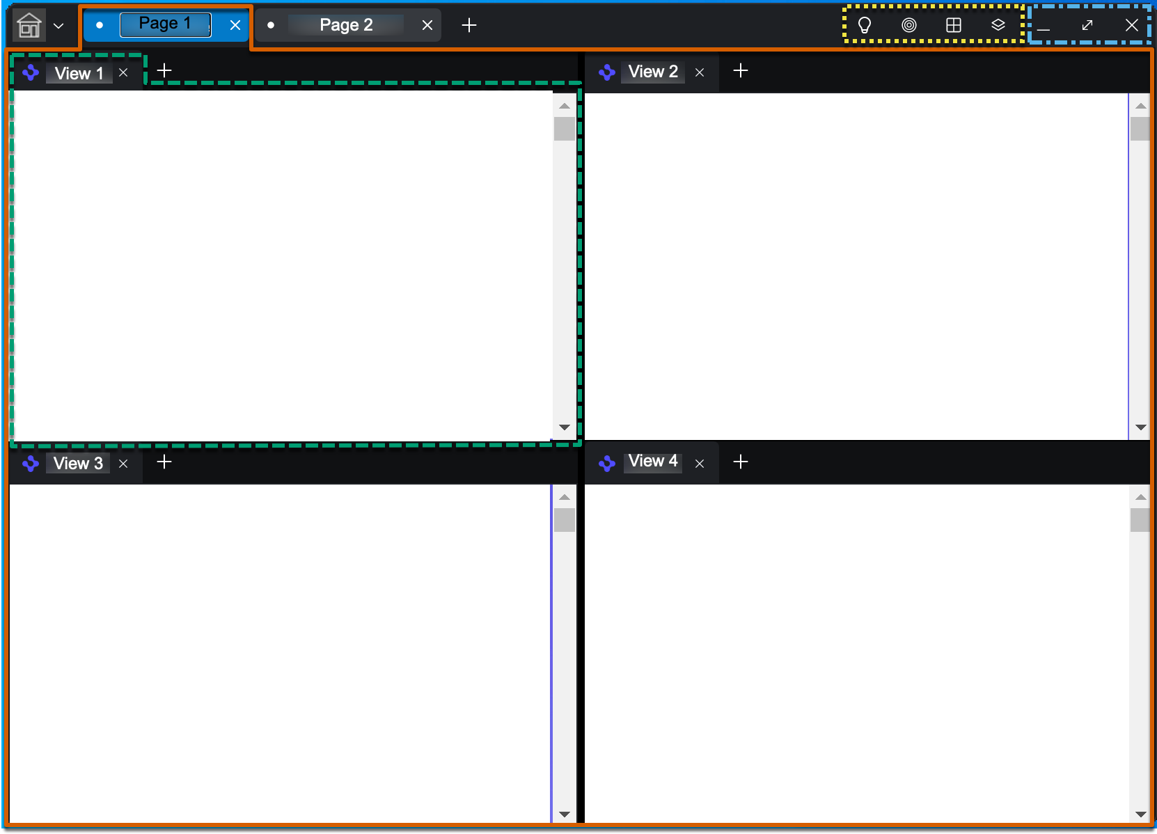
Window
An OpenFin window is a window at the level of the operating system. It has an icon in the upper left corner and a title, which is not displayed directly on the window but is available via the taskbar icon. A window is represented by the Window class in the Container API.
Page
A page is a subsection of a window that enables organizing content views. Every window has at least one page, and can have as many as desired, if creating pages is enabled. In the figure above, the active page (Page 1) is outlined with a solid vermilion line. Pages can have tab hats by which to select them. A page is represented by the Page interface in the Workspace API.
View
A view is a subsection of a page that displays content, which can be a web page or app. It corresponds to a "tab" in a typical web browser. Every page has at least one view. One view in the figure is outlined with a bluish-green dashed line. A view has an icon and title determined by the content it is displaying.
Like pages, views can have tab hats by which to select them; view-level tab hats can be hidden, either programmatically or by the user, if enabled. Views can be arranged in various ways using the Change Layout tool in the Browser toolbar. In the figure, the views in Page 1 are arranged in a grid. If the user were to click the tab hat for Page 2, that page might contain completely different views in a completely different layout.
A view is represented by the View class in the Container API.
Browser toolbar
The Browser toolbar is outlined in the figure by a yellow dotted line. It contains tools for managing Browser pages and views. You can programmatically reorder them, remove them, or add your own tools.
- Hide Tabs/Show Tabs: Hides or shows view tab hats
- Color Linking: Selects a channel for a view to share data with other views on the same channel. When a view on a channel is active, a border appears around it of the color matching its channel. Refer to Channel API for details on how this is implemented.
- Change Layout: Changes the arrangement of views in the active page. Layouts include: Full Width, Columns, Rows, and Grid.
- Save Page: Prompts the user for a name and saves the page (including all its views and their layout).
Window control buttons
At the upper right corner of the window, the window control buttons enable the user to change the display of the window itself. In the figure, this area is outlined with a dotted-and-dashed sky blue line. These buttons are not customizable.
Context menus
When you select the window icon or a page or view tab hat, a menu appears. In Workspace v13 or later, a Print menu item with submenu items for print options is included.
Window context menu
When you click on the window icon, a menu appears with the following default items:
- New Window
- New Page
- Restore to Last Saved Changes
- Save Workspace
- Save Workspace As...
- Rename Workspace
- Switch Workspace
- Delete Workspace
- Downloads
- Appearance
- Save Page
- Save Page As...
- Print >
- Print All
- Print Screen
- Close Window
- Open Storefront
- Quit <name_of_workspace>
View tab context menu
When you select a view tab hat, a menu appears with the following default items:
- New View
- Open View with Default Web Browser
- Reload View
- Duplicate View
- Add View to Channel > submenu containing channel colors
- Remove View from Channel
- Print >
- Print All
- Print Screen
- Close View
Updated about 1 year ago